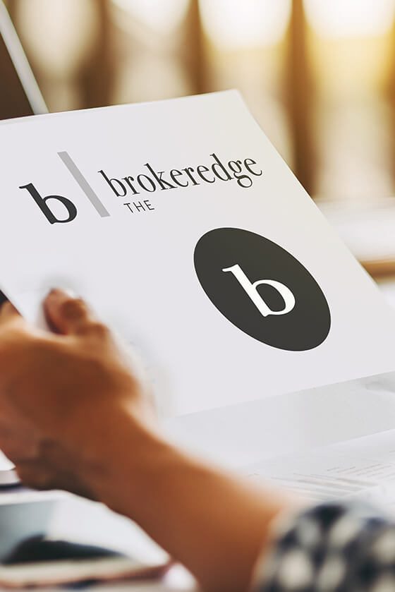
The Brokeredge logo showcases our commitment to straight lines and modern, crisp design. Check it out here, at our company portfolio! By viewing the entire process of creating this logo, you can better understand the exact feeling that our clients get when they choose LightHouse Graphics, so be sure to read all the way through!
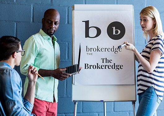
02
Development
This logo shows the importance of color contrast in a logo. Check out the way the white space works together with the page to create a beautifully organized, lettered logo.
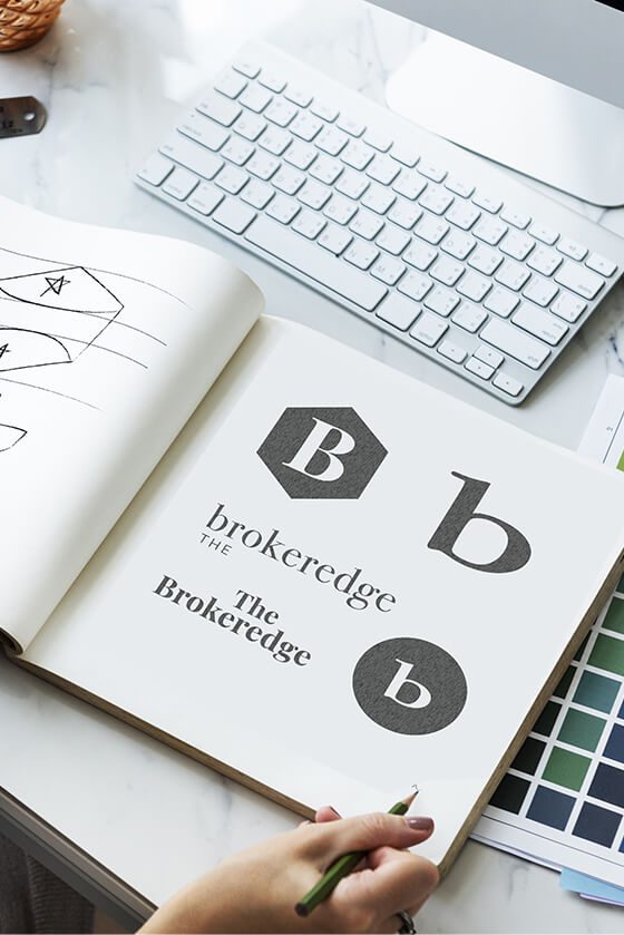
01
Conceptual Design
Sometimes, simple is best. When it comes to financial services in particular, clients are more likely to trust a logo that looks classic and strong. We wanted something that clients would find attractive, but reassuring.
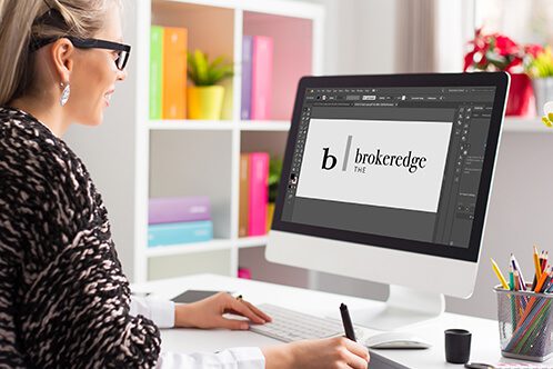
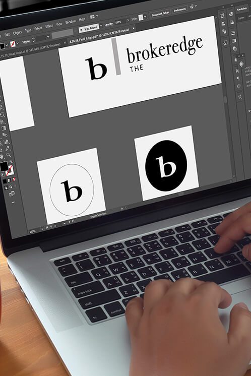
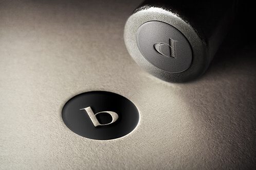
03
Execution
The best thing about a simple logo like this is that is adds a layer of enhanced transferability. A logo this classic can be printed, stamped, and more onto just about any surface you can dream of!
01
Conceptual Design
02
Development
03
Execution
01
Conceptual Design
Sometimes, simple is best. When it comes to financial services in particular, clients are more likely to trust a logo that looks classic and strong. We wanted something that clients would find attractive, but reassuring.
02
Development
This logo shows the importance of color contrast in a logo. Check out the way the white space works together with the page to create a beautifully organized, lettered logo.
03
Execution
The best thing about a simple logo like this is that is adds a layer of enhanced transferability. A logo this classic can be printed, stamped, and more onto just about any surface you can dream of!