The LightHouse Back Office Logo is all about instilling confidence in our clients. We want them to know that they can turn over the digital keys to their business, and feel at ease knowing we’ve got it covered!
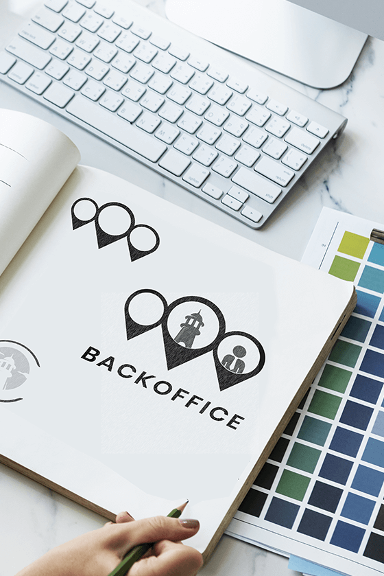
As we furthered the development of the logo, we added the green and orange icons to symbolize energy and growth. Because our business is dedicated to helping your business maximize its potential, we wanted colors to reach out and indicate just that.
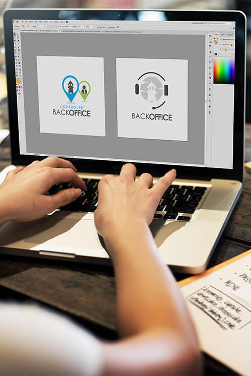

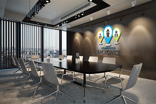

The first part of our logo that viewers notice is the blue icon in the center. Because in the design world, blue is used to indicate authority, integrity, intelligence, and peace, we wanted it to be the first signal sent to users.
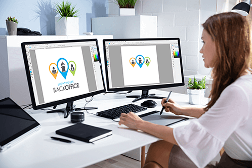
Our final product is one that conveys just what we want clients to know about our business, before they even speak to us. We know that when they reach out, they’ll be just as impressed by our knowledgeable and efficient team. Hopefully, though this, we can improve the efficiency and reach of small to medium-sized business everywhere.

The first part of our logo that viewers notice is the blue icon in the center. Because in the design world, blue is used to indicate authority, integrity, intelligence, and peace, we wanted it to be the first signal sent to users.

As we furthered the development of the logo, we added the green and orange icons to symbolize energy and growth. Because our business is dedicated to helping your business maximize its potential, we wanted colors to reach out and indicate just that.

Our final product is one that conveys just what we want clients to know about our business, before they even speak to us. We know that when they reach out, they’ll be just as impressed by our knowledgeable and efficient team. Hopefully, though this, we can improve the efficiency and reach of small to medium-sized business everywhere.
Charleston, SC
Boston, MA
Phoenix, AZ
Lansing, MI
Franklin, TN