Looking for talented people to create your Right Hand Logo Design? We here at LightHouse Graphics can help you!
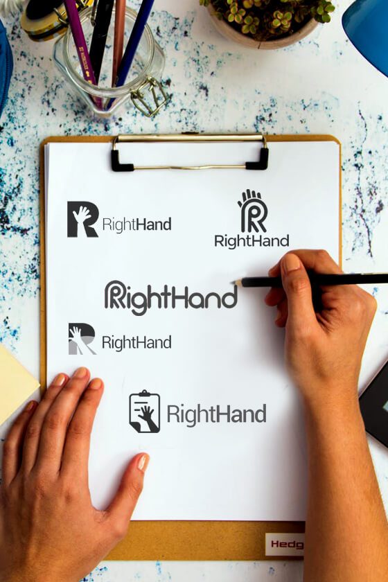
When Right Hand came to us for a logo, we created a couple of mock ups to ensure they had options of everything we could provide. Ultimately, it was important to find a design that expressed strength and collaboration, indicated by the double lines in the first letter of their logo. Additionally, we opted for red, which is a strong, bold color choice indicative of clear leadership and direction.
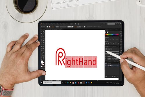

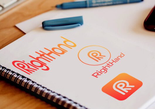
Our process for creating logos is largely collaborative. Because your logo expresses everything about your brand in one simple image, it is important to us that we work together to create the perfect snapshot of your business.
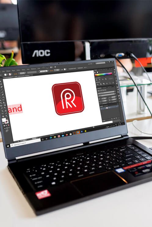
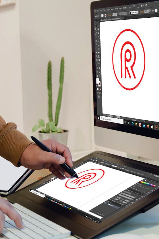
Once we had the layout of the design decided, it was important to determine colors. We went with warm colors for this one, with a heavy emphasis on the color red. Because red stands for passion and energy, it was the perfect choice for these game-changing clients.


Our process for creating logos is largely collaborative. Because your logo expresses everything about your brand in one simple image, it is important to us that we work together to create the perfect snapshot of your business.

When Right Hand came to us for a logo, we created a couple of mock ups to ensure they had options of everything we could provide. Ultimately, it was important to find a design that expressed strength and collaboration, indicated by the double lines in the first letter of their logo. Additionally, we opted for red, which is a strong, bold color choice indicative of clear leadership and direction.

Once we had the layout of the design decided, it was important to determine colors. We went with warm colors for this one, with a heavy emphasis on the color red. Because red stands for passion and energy, it was the perfect choice for these game-changing clients.
Charleston, SC
Boston, MA
Phoenix, AZ
Lansing, MI
Franklin, TN