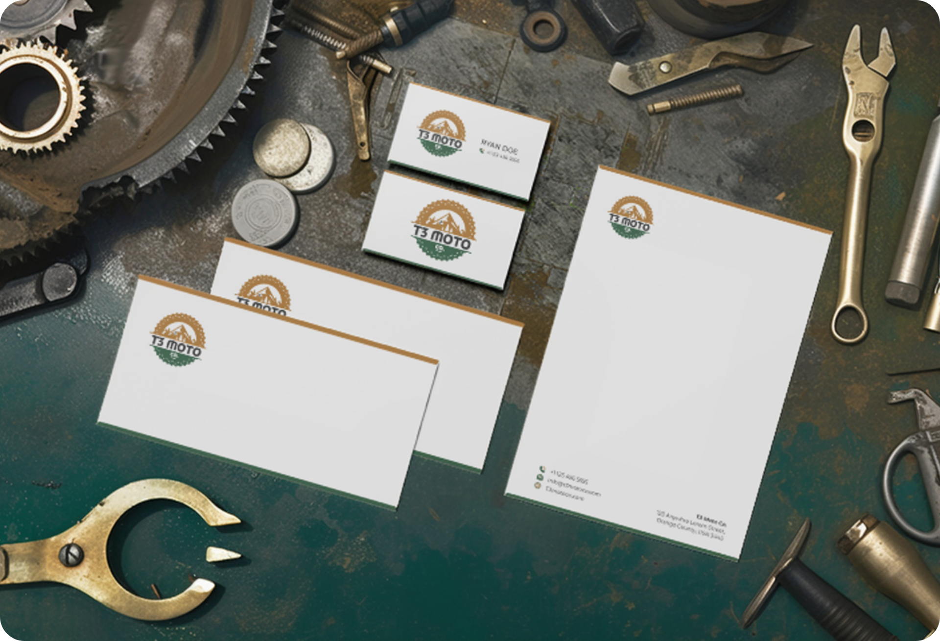
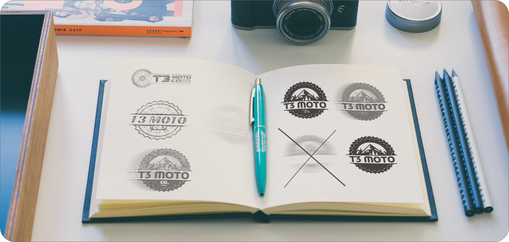
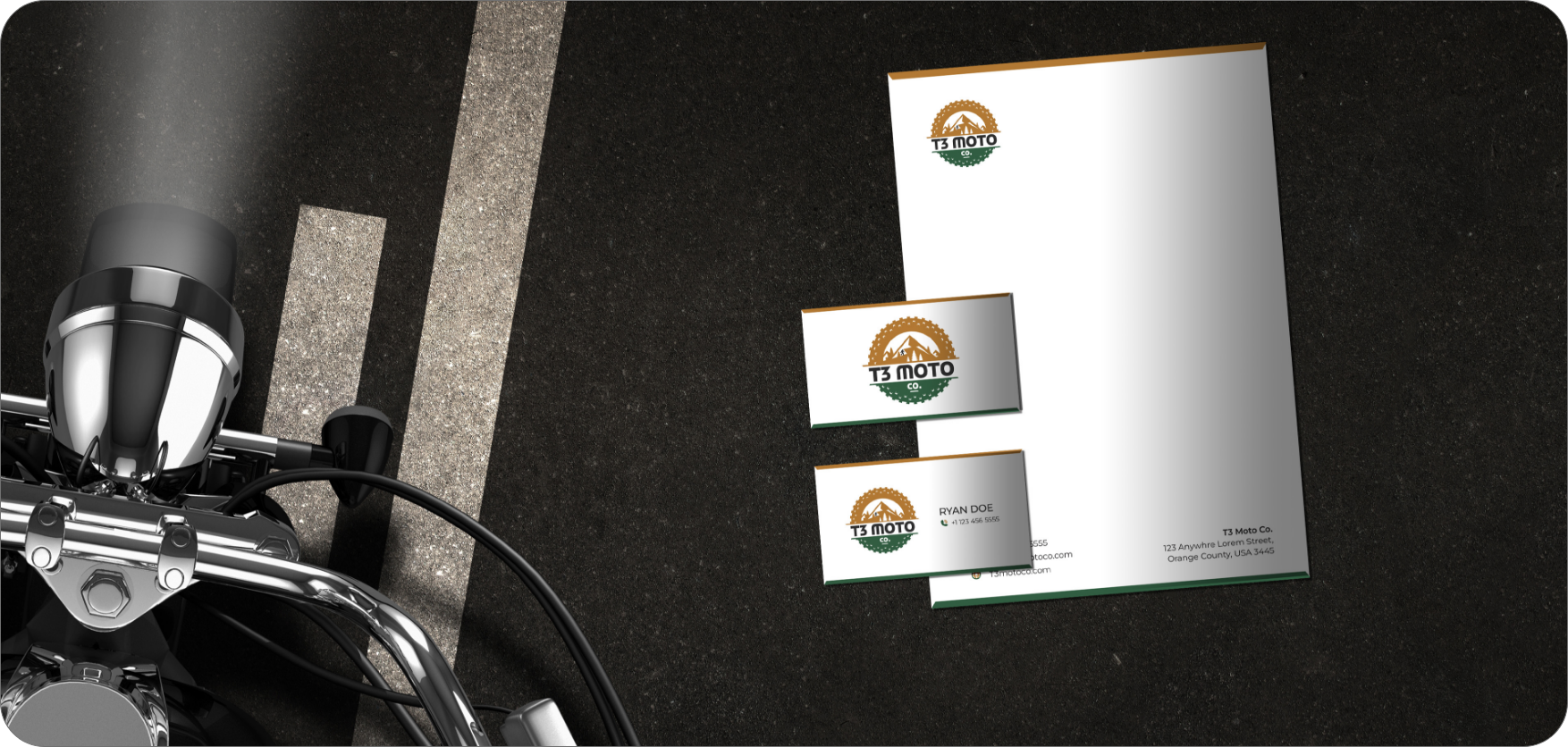
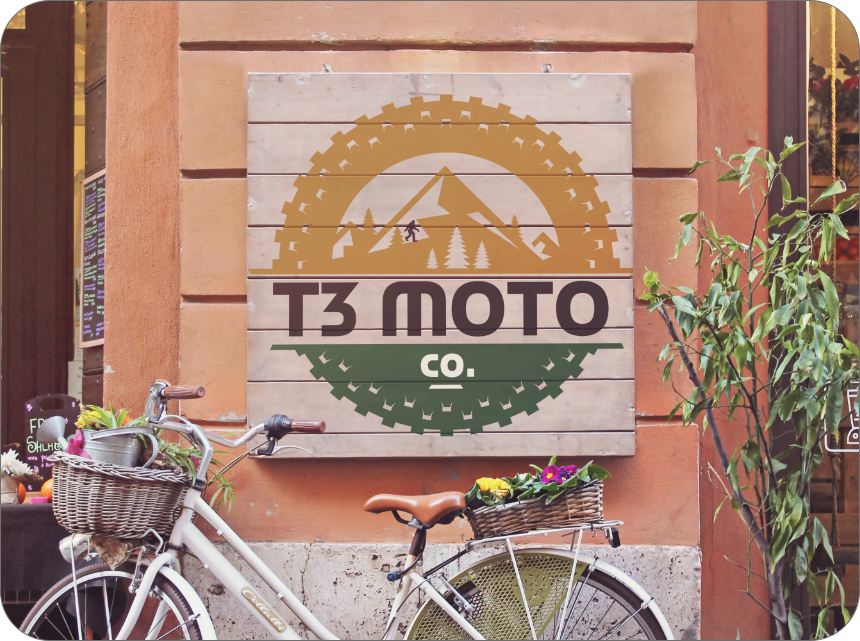
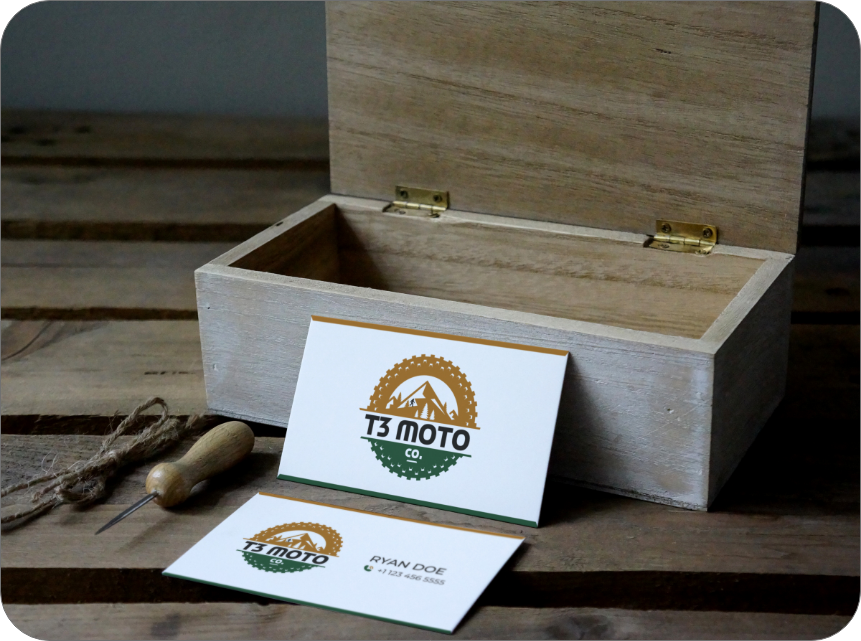
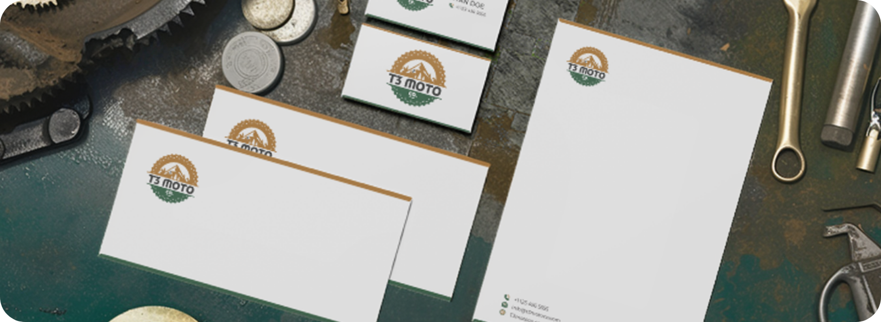
Graphic Design, Logo & Branding
With a clear concept in place, we shifted to visual development. This phase focused on creating a flexible system for branding in the outdoor industry—one that could scale across packaging, social, and merchandising.
We chose earthy tones drawn from real trails: dust browns, moss greens, and stone grays. Landscape photography and graphic motifs added motion and grit. Typography needed to match that energy, so we picked strong, bold fonts that felt mobile and powerful. Through it all, we emphasized consistency and visual storytelling.
Once the design system was finalized, we applied it across all of t3 Moto’s brand assets. Logos, product labels, social templates, and marketing materials were aligned under one identity.
We also delivered a detailed brand guide to support future use. It covered tone, logo rules, typography, and color specs—everything needed to keep their nature-inspired branding strong and consistent. As a result, t3 Moto now shows up with clarity and confidence across every touchpoint. Their new visual identity delivers consistent, high-impact outdoor lifestyle branding across every platform.
Looking for more branding examples? Explore our branding for schools or product packaging identity work to see how we tailor identity systems across industries.