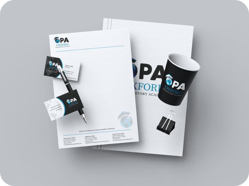
Graphic Design, Logo & Branding
We began the conceptual design phase by aligning the brand with OPA’s core values. Our goal was to create a visual system that captured the essence of a school rooted in higher learning and inclusivity.
We focused on themes like growth, community, and scholarly pursuit—ideas that reflect what OPA stands for. These elements served as the foundation of the school branding strategy and helped guide our visual direction throughout the project.
Next, we moved into design exploration. This phase was about turning values into visuals. We experimented with multiple directions that reflected academic integrity and inclusion—using symbols tied to knowledge, culture, and progress.
The chosen color palette included warm, inviting tones that conveyed trust and intellect. We selected typography that was clean and professional, helping ensure the brand felt both welcoming and authoritative. Every design decision supported the goal of building a strong and accessible school brand.
Once the visual identity was finalized, we applied it across all of OPA’s communication channels. This included logos, letterhead, print collateral, digital materials, and templates for staff use. Each application was reviewed to ensure clarity and consistency.
To empower the internal team, we delivered comprehensive brand guidelines. These documents outlined best practices for color use, typography, imagery, and messaging—ensuring that OPA could maintain its school branding standards as the organization continued to grow.
Looking for more branding inspiration? Explore our full portfolio to see how we bring brand strategy to life across industries—from education to lifestyle to community-driven projects.